As any designer would tell you, Type and the way it’s set can make or break your project. Your project fonts will help you convey style, tone and even quality. Making the right choice is therefore key when starting any design project that will include type. I hope my list will help you find the perfect typeface for your next project.
While most of your font use probably doesn’t require much effort and you can either use your system’s fonts or download a free font from the extensive Google Fonts library, for that extra special project, you may want to look into more options.
Of course, if you have a small budget, even better! For $25 – or even less – you can purchase a quality font and give your high-profile projects that extra pizzazz!
So here’s a list of five typefaces I’ve been using for a number of years now.
Dave Gibbons
When you want to use a super informal font, say maybe something one would use in a comic book, which one comes to mind first? NO, NO – not that one! Bite your tongue!
OK so admittedly we might all think of Comic Sans first, but truth be told, there are some quality comic book typefaces out there, and Dave Gibbons is definitely one of them – it is, in fact, my favorite comic book font.
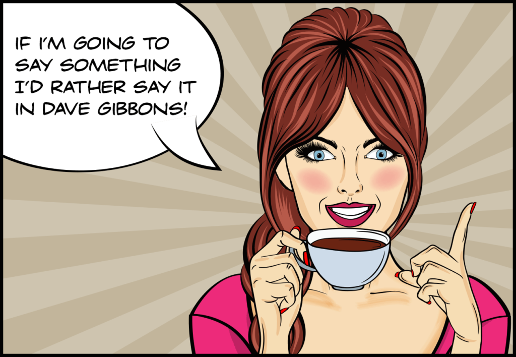
Comic Artist and Letterer Extraordinaire
So who is Dave Gibbons, you ask? Well if you’re a comic book fan, maybe you don’t need to ask… probably best known for his work on the Watchmen series, Gibbons is also widely recognized for his unique lettering style, it’s therefore quite fitting a typeface would be based on it, especially for those of us desperate to avoid some of the rather unfortunate alternatives.
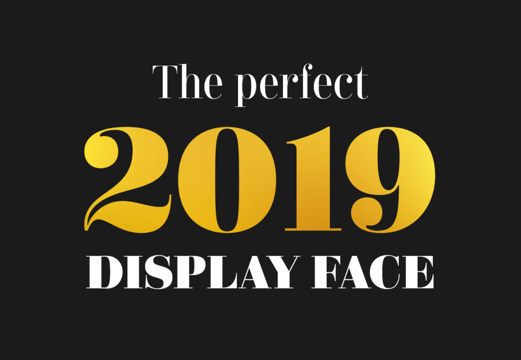
Didonesque
Looking for something that says tradition and prestige? Maybe something you can use for an anniversary logo? Why I used Didonesque for that very purpose myself last year. Looked great, and the foil stamping my client used on the printed invitations was nothing short of stunning.
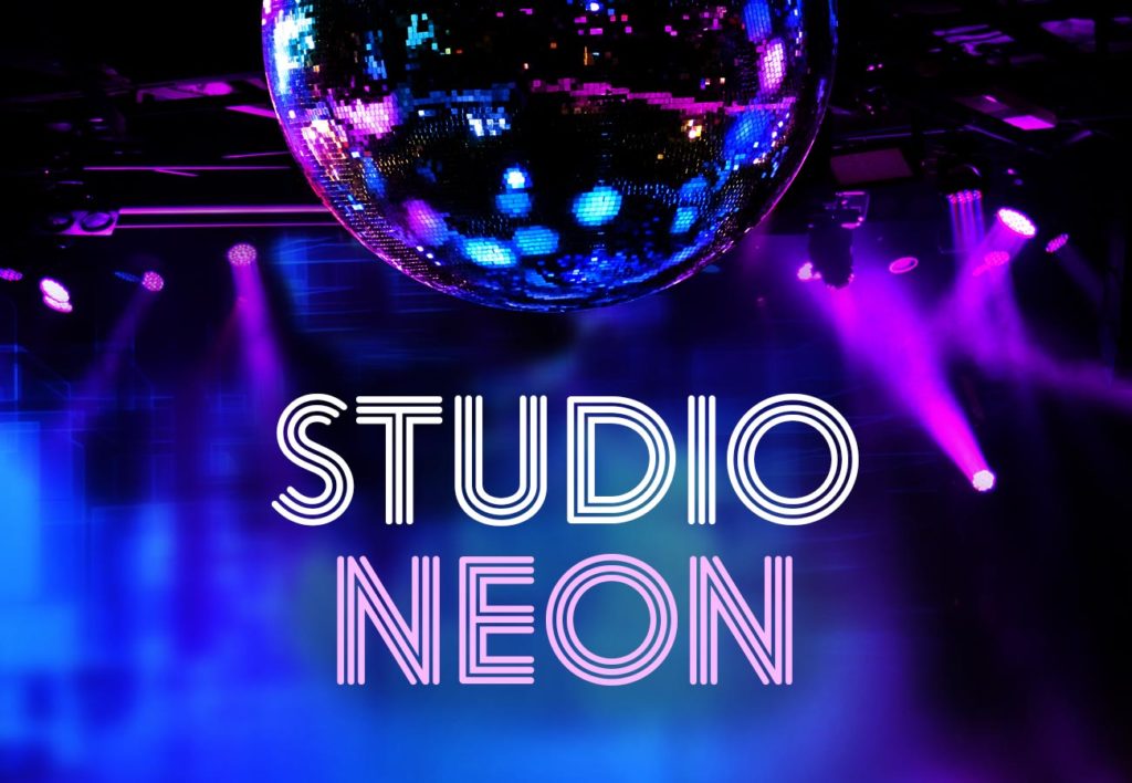
Studio Neon
This multiline font can be somewhat more playful and reminiscent of styles popular in past decades. You can add all sorts of effects to further enhance its festive and fun appearance. You can also vectorize the different strokes and change their individual colors to create an even richer look. On the right project, you can go all out with Studio Neon.
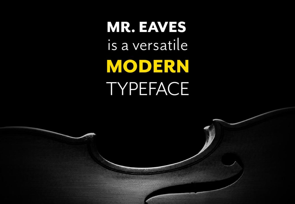
Mr. Eaves
Initially designed to be the sans-serif companion of Mrs. Eaves, Mr. Eaves works perfectly well on its own. I especially like it because while in many ways, it does have a modern, simplified design, there’s also something somewhat traditional-looking about it, that makes it a particularly classy typeface. I don’t tend to use it for large passages of text, but it can work quite well in larger sizes as a display face or for shorter chunks of text.
Univers
When it comes to the International Typographic Style movement, people typically tend to think of Helvetica first. And for good reason, the typeface was so successful and so often used at the time, it has forever become synonymous with the movement. But if I’m going to be honest, I’ve always kind of favored Univers, designed by Adrian Frutiger in 1957, simply because when it comes to the neo-grotesque family, I find Univers to have the most flawless character design.
Again, of course, it is not a typeface suitable for body type – especially not in its condensed versions – but it can work quite nicely as a display face especially if you only need a couple of words to be displayed. I think it’s particularly effective in conveying short, strong messages.
Find your dream font…
So those are my five font picks for today. I didn’t discuss how to pair these fonts, which is, of course, a very important aspect of typography, but perhaps a topic for a different post.
In the meantime, if you want to look at more typeface options, here are a few choice destinations: